Thursday, December 10, 2009

Head of the Asylum

Chris Lee is my favourite designer at the moment (by far). His work is intelligent, challenging, creative and inspirational. His Singapore based company, Asylum, is a design studio, retail store, workshop and record label. He is a bit of a RockStar apparently, and has mastered the art of creativity, purpose and aesthetic precision across multiple disciplines.


"An art director is an overpaid designer hence a smarter one. A branding agency is a design agency that realizes that they are not very good at creativity so they have to write a lot of justification to make insecure clients feel that their money’s well spent." – Chris Lee


Wednesday, December 9, 2009

Serious Play

I'm a massive fan of TED. If you ever find yourself eating lunch at your desk, try to forgo the news site or facebook for 20 minutes, and find a presentation on TED, on a topic you're interested in. There are some real gems. I've posted this because I think Stuart Brown has touched on a compelling subject (especially for design and creativity), linking the idea of 'play' to problem solving and human interaction. Considering the content, his delivery is quite bland, but nonetheless interesting.

Typographic Conundrums

A new book by Harry Pearce that looks somewhat entertaining. If only for an hour or so. What I do find interesting is his self regulation on the design of his new book: 1 Box, 2 colours, 1 typeface. That's it. For 176 pages. Hopefully the ideas are strong enough to ensure this book is not just another example of a self indulgent designer amusing himself... ie not like me and this blog :)

Wednesday, December 2, 2009

True Blood

I'm not particularly a fan of the show, but I do love the opening credits. The imagery, transitions, typography and even the music had me drawn in from the first second.

Tuesday, November 10, 2009

The MINI Creative Challenge

Not a bad way to win $5000 and get your ad concept into Creative Mag. More details / entry form here.

An uplifting rebrand for the uplifting company

The makers of Viagra and Lipitor, Pfizer, reported a mere US $48.3 billion revenue in 2008. Which isn't too shabby – especially in these economic times. So it seems they've decided to celebrate by updating their 18 year old brand identity.
At first glance, it may go unnoticed. Sure they've added a gradient, tilted the oval and done away with their serif font. All of which I think are improvements. Is it really enough though to warrant the time and money that a massive rebranding project like this would've involved? Probably not. Which is why I'm stoked that Siegel+Gale make the most of this opportunity. The true creative genius here is the application of the new brand. Let's face it, Pfizer and all their ideas of brand equity and heritage probably had some strong views on how much the logo should change. However giving it another dimension, and a variety of executions is where this identity takes on a new life.

A rich and diverse colour palette, the use of illustrative dots, emotive imagery and some clever copywriting take this new Pfizer brand beyond the corporate conventions of the Pharmaceutical world.

See some of their brand in action at http://www.pfizer.com/home/

Tuesday, September 22, 2009

Tokyo

I love this short video by Joan Jimenez. The imagery / music / mood is captivating.

Saturday, May 23, 2009

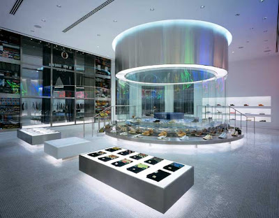
Experiencing Retail

A few cool retail examples below.


Daring to be Deus Ex Machina

Back in February, we had the pleasure of Dare Jennings attend our conference to share some of his ideas and experiences. Dare Jennings was the creator of the hugely successful Australian cult brand, Mambo.

This week, with thanks to AGDA and their Designer Dinner series, I (and about 9 others) had the opportunity to have dinner with Carby Tuckwell – Dare's business partner in their latest cult brand, Deus Ex Machina. Carby's previous life was as a Designer and Art Director, and he is now flexing his creative muscle for his own 'label' (I'm using that term very loosely). For a table full of agency designers, this informal chat over good food and wine, with a designer-turned-successful-entrepreneur, was inspiring. 

Although (by his own admission) Carby has been blessed with a fairly decent business partner.

Dare Jennings founded Mambo. An anti-establishment brand born in 1982. Dare's love of the surf was shared with many at the time, but surfers were not yet stereotyped into a mould of what they looked like or how they behaved. There were obviously some perceptions, but Dare wanted his brand to stand for so much more. Even the name Mambo was selected because of its wider connotations to music, art and politics. A sub-culture identity that didn't take itself seriously, wasn't afraid to take risks, collaborated with other people and industries, but never used an advertising agency. Mambo embodied an attitude at the grass roots level. Some might say 'exploiting the youth', but they were probably craving some identity at the time. Mambo has since lost it's way under corporate control, and Dare exited at an opportune time. 
A timely exit: Mambo designed the 2000 Australian Olympic uniform, reaching it's peak of popularity and awareness as an Iconic Australian brand. But was this also the beginning of it's demise? Is this the moment where commercialisation crushed the brand and what it stood for? Who knows. But this is when Dare Jennings decided to move on (with very full pockets).

Now he's teamed up with Carby to create Deus Ex Machina. Another brand wreaking of authenticity and irreverence. Inspired by a Japanese sub-culture where biking enthusiasts customise their machines, Deus offers contemporary, custom-built, collectable motorcycles to the Australian (and Global) market. A unique, non-mass-market brand idea that has now successfully extended to clothing, bicycles and hospitality. 
Just like Mambo, the creative authenticity shines through in every expression of the brand – from their brochures, website and retail space to their clothing and motorcycle designs. And as an authentic experience, there's something special about sipping a coffee in the Deus cafe, watching real mechanics working on real bikes, hearing the roar of an engine and catching a scent of oil in the air. And in amongst this grass roots environment, there's the beautiful, museum-like showpieces.

At it's core, Deus Ex Machina taps into the idea of individualism and self expression (not so easily achieved in today's mass-marketing, brand savvy environment). A creatively authentic brand that stands for more than motorcycles, and engages consumers with so much more than a corporate logo. Their followers are excited and loyal, and can get involved on a number of levels. And their most famous follower, Orlando Bloom, is hoping to start the LA chapter.

Dare has done what he does best, pioneering another unique Australian cult brand. And Carby Tuckwell has created a visual language for the brand, and is having fun applying it wherever consumers will let him. http://www.deus.com.au/


Wednesday, April 15, 2009

Tropicana's rebranding debacle


It seems rebranding is in the air at Pepsico.

The biggest orange juice brand in the world, Pepsico's Tropicana, recently embarked on a packaging redesign. Who knows why exactly. But in the process, they lost their unique typographic logo, and their well known image of an orange and straw... Just take a second to comprehend the magnitude of that last sentence. They 'lost' their two key brand identifiers at the most important touchpoint – the point of sale. The new packaging has taken on a more 'generic' look. The close up of a glass of orange juice is (dare I say it) piss-weak compared to the authentic orange, and the Tropicana logo has been reduced to a single font, which is also used for the other information.

Subsequently, unit sales dropped 20% between January 1 and February 22 this year. Equating to $33mil in lost sales. Not to mention the cost of rebranding. After the dip in numbers, Pepsico decided to scrap the new Tropicana design and move back to it's iconic packaging (another huge and costly logistical task). They've put the wheels in motion to get the brand back on track, however their 20% loss has been a gain for the challenger brands – Minute Maid, Florida's Natural and Tree Ripe. So it's going to be hard ground to recover.

Just another shining example of a top-down approach to brand reinvention. And another unsuccessful Pepsi redesign that can be traced back to the Arnell Group. If you haven't seen their effort with the Pepsi rebranding, click here for an earlier post. To view a video of Peter Arnell defending the new Tropicana design, click here

Thursday, March 26, 2009

Defining (sickening) beauty

His work makes me sick to my stomach. But I mean that as the highest form of flattery. It's not his fault I'm in awe of his creative talent, or that the beauty of his work acts like a sledgehammer of reality and self realisation. As much as I aspire to be like him, I'm a fair way off at the moment.

Fabien Baron is arguably the most celebrated and successful Art Director in the fashion arena – magazines, packaging, identities, advertising and product design. Hailing from France, he moved to New York in 1982 and landed the top job at GQ. He then divided his time between Milan and New York as Creative Director of Italian Vogue, before ending up at Harpers Bazaar. He began his agency, Baron & Baron in 1990, and since then, has been the go-to guy for any brand requiring high-fashion creativity delivered with aesthetic precision. 

"Fabien and I are on the same wavelength, except Fabien goes beyond my capability of aestheticism." – Calvin Klein.


Looks like he's got this market sewn up, but my ideal goal for Graphic Surgery would be to become the Baron & Baron of Australia.