Thursday, December 10, 2009

Head of the Asylum

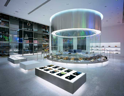
Chris Lee is my favourite designer at the moment (by far). His work is intelligent, challenging, creative and inspirational. His Singapore based company, Asylum, is a design studio, retail store, workshop and record label. He is a bit of a RockStar apparently, and has mastered the art of creativity, purpose and aesthetic precision across multiple disciplines.


"An art director is an overpaid designer hence a smarter one. A branding agency is a design agency that realizes that they are not very good at creativity so they have to write a lot of justification to make insecure clients feel that their money’s well spent." – Chris Lee


Wednesday, December 9, 2009

Serious Play

I'm a massive fan of TED. If you ever find yourself eating lunch at your desk, try to forgo the news site or facebook for 20 minutes, and find a presentation on TED, on a topic you're interested in. There are some real gems. I've posted this because I think Stuart Brown has touched on a compelling subject (especially for design and creativity), linking the idea of 'play' to problem solving and human interaction. Considering the content, his delivery is quite bland, but nonetheless interesting.

Typographic Conundrums

A new book by Harry Pearce that looks somewhat entertaining. If only for an hour or so. What I do find interesting is his self regulation on the design of his new book: 1 Box, 2 colours, 1 typeface. That's it. For 176 pages. Hopefully the ideas are strong enough to ensure this book is not just another example of a self indulgent designer amusing himself... ie not like me and this blog :)

Wednesday, December 2, 2009

True Blood

I'm not particularly a fan of the show, but I do love the opening credits. The imagery, transitions, typography and even the music had me drawn in from the first second.

Tuesday, November 10, 2009

The MINI Creative Challenge

Not a bad way to win $5000 and get your ad concept into Creative Mag. More details / entry form here.

An uplifting rebrand for the uplifting company

The makers of Viagra and Lipitor, Pfizer, reported a mere US $48.3 billion revenue in 2008. Which isn't too shabby – especially in these economic times. So it seems they've decided to celebrate by updating their 18 year old brand identity.
At first glance, it may go unnoticed. Sure they've added a gradient, tilted the oval and done away with their serif font. All of which I think are improvements. Is it really enough though to warrant the time and money that a massive rebranding project like this would've involved? Probably not. Which is why I'm stoked that Siegel+Gale make the most of this opportunity. The true creative genius here is the application of the new brand. Let's face it, Pfizer and all their ideas of brand equity and heritage probably had some strong views on how much the logo should change. However giving it another dimension, and a variety of executions is where this identity takes on a new life.

A rich and diverse colour palette, the use of illustrative dots, emotive imagery and some clever copywriting take this new Pfizer brand beyond the corporate conventions of the Pharmaceutical world.

See some of their brand in action at http://www.pfizer.com/home/

Tuesday, September 22, 2009

Tokyo

I love this short video by Joan Jimenez. The imagery / music / mood is captivating.

Saturday, May 23, 2009

Experiencing Retail

A few cool retail examples below.